By Bill Foster
How to create a visual image that succinctly articulates your mission and message.
As a believer, I must admit that “branding” and “church” are two words that still seem uncomfortable when put together. True believers never want to compromise their faith by commercializing its message. But as a design professional for 20 years, I’ve discovered that a respectful, distinctive branding platform can enhance, focus and ignite enthusiasm for the mission and message of a church. Lawndale Baptist Church (LBC) in Greensboro, NC, is a good example of how this can work.
First, a brand is the image that others have about your business or organization. It is earned – for better or for worse. Your brand is the handshake that your business or organization makes with your audience when no one is around to say how great he or she thinks it is. For this reason, your visual communication must be distinct, consistent and relevant.
Designing a fresh logo
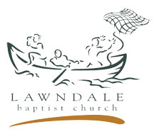
At Lawndale Baptist, senior pastor Dr. Joe Giaritelli recognized that it was time to replace the dated praying hands symbol (in traditional burgundy ink) with a more current logo and to begin refreshing how the church communicated with the community. We discussed that the decision makers in this process would be the senior staff instead of the church body at large.
 I think this is a wise approach. More decision makers will cause the design firm to anticipate a longer process due to more rounds of revisions. This means the price estimate of your job will increase accordingly. Additionally, getting feedback from a large committee or congregation is unmanageable, possibly contentious, and results in a muddled and compromised design.
As for the final “fishermen” logo itself, many find its non-churchy feel and contemporary execution of the biblical metaphor friendly yet meaningful. For those who do not immediately discern its evangelistic reference, it’s a great conversation starter. Some nonmembers have made the comment that they are curious about visiting the church just from seeing the logo. The tagline, “The Journey: Vision, Teamwork, Harvest,” was supplied by the pastor and is a fitting mission statement for the church and articulates the symbolism nicely.
Maintaining consistency
With the LBC logo design established, we designed the print collateral such as stationery, office forms, church vehicles and others. These items should be designed, not merely excused by sticking the new logo on them. Adding a logo to an old graphic platform is sort of like wearing a new tie with an old suit – it makes both look out of place.
Your church should receive guidance from the design firm as to the proper usage and application of the logo so that support staff at your church can maintain consistency in how the logo is used, thereby establishing and reinforcing your identity.
Chief among the promotional pieces in a branding campaign is obviously a website. The website at LBC was done as a separate phase of the campaign due to its size, expense and importance. If your church has a membership of more than a couple thousand, with numerous ministries and programs, anticipate a few months for the design, content building, editing, programming and testing before your site goes live. Even after it is live, allow for a few weeks of fine-tuning plus the standard ongoing maintenance and updating.
There were two competing schools of thought for the branding emphasis of the LBC home page: (1) An advertising approach (“Look at our events and programs”), or (2) A philosophical approach (“What brings you to our church?”). Both approaches can be executed effectively, but the chosen design simplified by white space and a single rotating image, emphasizes the latter.
As each photographic image of people’s various journeys is shown, the question, “how’s your journey?” is asked and then punctuated by the invitation, “… join us on the journey.” Take time to decide what message you want to convey in that initial handshake the viewer makes with your church as it will most likely be on the web.
Does it work?
One LBC member asked, “Do we have any assurance that these new materials will bring more people into the church?” This is not a bad question, but it’s slightly misdirected regarding what a good graphics platform actually does, which is to create confidence, credibility and familiarity in consumers (potential church attendees) – not make sales (members) outright.
Judging from the growth and vigor at LBC, the brand seems to be doing its part. Your members and the Holy Spirit are there to do the rest.
Bill Foster is the owner of HigherWerks Inc., a branding and design firm in Oak Ridge, NC (www.higherwerks.com) and is the author of Meet The Skeptic, an apologetics curriculum and ministry.


Everyone loves what you guys are usually up too.
Such clever work and exposure! Keep up the good works guys I’ve added you guys to my personal blogroll.