By Sam Batterman
For the church as a whole, managing growth and juggling schedules for limited resources in aging facilities are ongoing issues. In response, churches have begun to move away from enormous building funds for reconstructing existing sites into ever-larger churches, to a more networked, multi-site approach.
The reasons are numerous — parking, for starters. One of the biggest difficulties with a monolithic approach is how to handle parking during construction at a church that’s already at capacity. (Otherwise, why build?) This disruption might actually drive visitors away and make getting into the parking lot too difficult for elderly members and regular attenders.
Another challenge is how to handle the old facilities as the new ones come on-line — a whole other building project unto itself!
This is just one of several great articles from the new eBook, Reimagining Software.
Download it for free on our website.
Finally (as many pastors acknowledge), building projects are one of the primary reasons for church splits in America — not just because of the cost and organization, but because of the number of stakeholders who need to be satisfied.
Building a church is full of risk; but, adopting a multi-site model seems to solve many of these issues. To this end, deciding where to plant a new campus is paramount to its success.
Using data in brand-new ways
Seraphim is a cloud-based church management system (ChMS) that takes a very modern approach to statistics and data reporting. We’ll show a number of examples in this article for how data and intelligence can “tame the beast” of deciding where to open a new multi-site campus.
Seraphim has all the features you’d expect a ChMS to have, but it adds a very specific focus on getting useful intelligence out of the database for making critical decisions.
The information in your ChMS is extremely valuable for solving this problem, as long as you know how to describe what you’re looking to get out of the database. From that point, it’s easy to use this information in a way that helps you solve a problem — such as figuring out where to put a new church plant.
Seraphim lets you create groups of nearly infinite variety. The difference is that these groups inherently “know” about geography — where things are located. In this example, we need groups that have the following type of characteristics:
- How many people are coming to your church, and from how far away are they traveling?
- How many members are coming, and where are their concentrations?
- How many visitors are coming? Optimally, it would be great to see “old” visitors and visitors who have recently started coming.Can we ease their burden of travel?
- Can we start the new site in a place that has good, faithful members for service and giving? Money isn’t everything, but it matters a lot for a church plant.
- How disruptive will this be to existing ministries, such as small groups and affinity groups?
Let’s get started!
Seraphim has a great feature called Smart Maps which enables users to composite the information for various groups onto a map.
Maps are easy to understand, and therefore represent a great way to socialize the data contained within Seraphim.
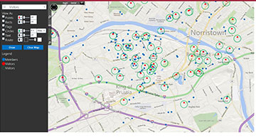
The first step is to understand the geographic distribution of everyone visiting your church. This includes members, regular attenders and visitors.
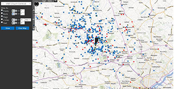
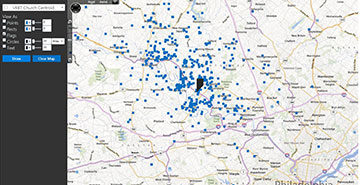
Here, I’ve created a group that pulls everyone who visited the church since January 1, 2014. I then plotted them (as blue rectangles) based on their residential location. I also plotted the location of the current church location (with a single flag). You can already see the three major epicenters where people live.
Next, we add markers for people who visited in 2013 but haven’t returned in 2014 (as small red circles). We superimpose this information on everything we’ve already laid down on the map. I also added visitors who have visited the church in 2014 (as green circles).
With this single view, we can now see everyone who travels to our church, including visitors last year and this year.
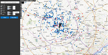
Now, we might want to look at travel times. Using the church as the center point, we add two circles — an orange one for 20-mile travelers and a purple one for 10-mile travelers.
Given this picture, a more informed decision-making process can begin regarding where to put a new campus.
Additionally, include age studies (young families, older families and so on), as well as giving potential.
Above all else, prayer and the Will of God are paramount to this decision.
Connecting people, spatially
Another way to use spatial information which our customers are finding appealing is visualizing the proximity of members and visitors to one another. There are a lot of uses for this scenario, but the biggest opportunity is one of care and growth.
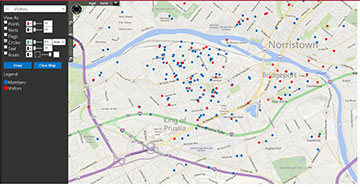
For example, look at the map below. You’ll see blue dots representing the residential locations of members and red dots representing guests who have visited the church. The tight coupling between the two groups is very noticeable, with some visitors being literally across the street from some of the members.
To amplify this grouping, we place green circles at one-tenth of a mile around each visitor record. This picture shows all the members directly in the vicinity who can invite them to a community group or a backyard barbecue, or take them a dessert.
Another application might be for vacation bible school, or VBS. Perhaps you’d like to have a snail mail campaign and send brochures into specific neighborhoods where children who have attended your church are living. The assumption is that where some children are, there are more families with children of similar age.
Seraphim has a super cool new feature in Smart Maps (called Route) which lets you trace point-to-point from a group’s location to a specific location — in this case, the church.
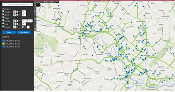
This feature is used in the following map, where all children (12 and under) who have visited the church in the last year are plotted as blue rectangles. Then, a route is run and rendered in transparent green. You can quickly see neighborhoods that stand out where you might send brochures and flyers for a VBS event.
These features are standard with Seraphim and can be used in many ways. One example is viewing your church’s bus ministry in comparison to where visitors live. Or, you can view visitors in comparison to small groups and members.
We hope these scenarios and examples have inspired you to use your ChMS data in a geographic manner.
Sam Batterman is president and CTO of Seraphim Software, a cloud-based church management software company based in Collegeville, PA.
RELATED RESOURCES:
- Get (and keep) their attention — with software http://bit.ly/1q94q6d
- Seraphim — the next generation of church management and congregational engagement
- A safe place, always
