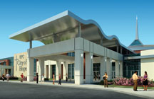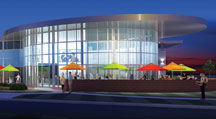
Contemporary church architecture trends exemplify warm and inviting spaces.
By Michael D. Barnes
We are all aware of how important first impressions are when it comes to personal relationships. But what about first impressions of a physical facility related specifically to church architecture?
 This first impression that someone receives is usually not about the members of the church at all, but rather, about the building that houses the church. Someone can make an uneducated assumption about your ministry before even stepping foot inside the facility. Is it impressive? Is it purely utilitarian? Is it imposing and intimidating? Is it inviting and warm? All of these first impressions of your church are actually based on the psychological response to the architecture of your church building.
In the past, church architecture has often been composed of large columns and steeples, an intimidating and stereotypical sight to a first-timer. In fact, most Boomers can associate with growing up in a church with this type of building. Over the last 10 years, we have recognized a tremendous trend in the design and construction of churches relating to the creation of an architecture that is friendly, warm, inviting and definitely non-threatening.
Fast-growing church
Recently, Barnes Design Group partnered with Kempsville Presbyterian Church, a large fast-growing church in Virginia Beach, VA. This project included the development of about 100 acres within the city of Virginia Beach. The overall design was to include a sanctuary to seat about 3,000 people, as well as a large Christian school and multiple supporting spaces, which exceeded 500,000 square feet.
 Kempsville Presbyterian also houses tremendous community outreach ministries. One of their goals was to create a dynamic architecture that would reflect the care and quality of their ministry. We were challenged to design a facility that would reach out to the community to bring people into a non-threatening environment, creating spaces that would translate into perceptions of transparency, honestly and openness.
Ultimately, the design resulted in two large entry-ways reaching out into the community, symbolizing loving arms to embrace visitors and bring them into the building. The key space located between those two major entries was not designated for a ministry space at all, but a cafe, a type of “third place” to be used as a gathering space for both parishioners and visitors alike. The café’s activities can be viewed from the neighborhood, as the exterior of this space was designed entirely of glass.
 The key aspect of “friendly design” of the exterior architecture is the forms that are used on the exterior of the facility. Next, the entry magnet is of critical importance as it should always gently draw people into a non-threatening gathering space. An attractive entry magnet, coupled with a soft non-religious gathering space is a tremendous design feature in the local church. The non-churched visitor has the opportunity to come into a gathering space and be greeted before ever ending up in the final worshipping space.
Your building should always reflect your ministry and spiritual objectives, and it can bless, minister and communicate to your first-time visitor well before a word is preached from your pulpit.
Michael D. Barnes is a church architect and CEO of Barnes Design Group, Church Architects, Virginia Beach, VA. [ www.BarnesDesignGroup.com ]


Why, if a church wants to create the perception of transparency and honesty, would it hide the worship space behind a facade of non-religious activity? Seems a bit ironic, not to mention disingenuous, to attempt to camoflage one of the church’s primary functions (worship) in the name of appearing more honest and open to those who are not members.